
Record of tests prints looking at exposure and image quality. Controlled test run. 5/2/23
TEST 1.
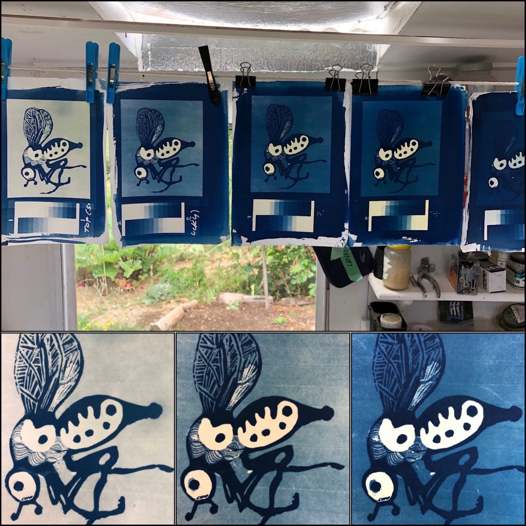
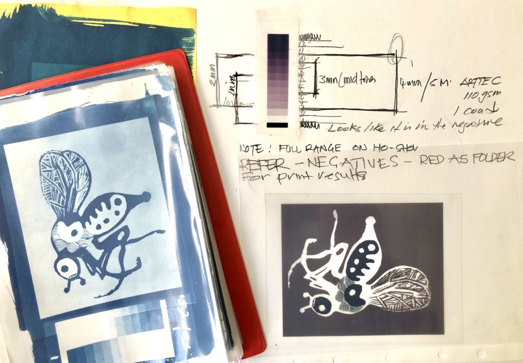
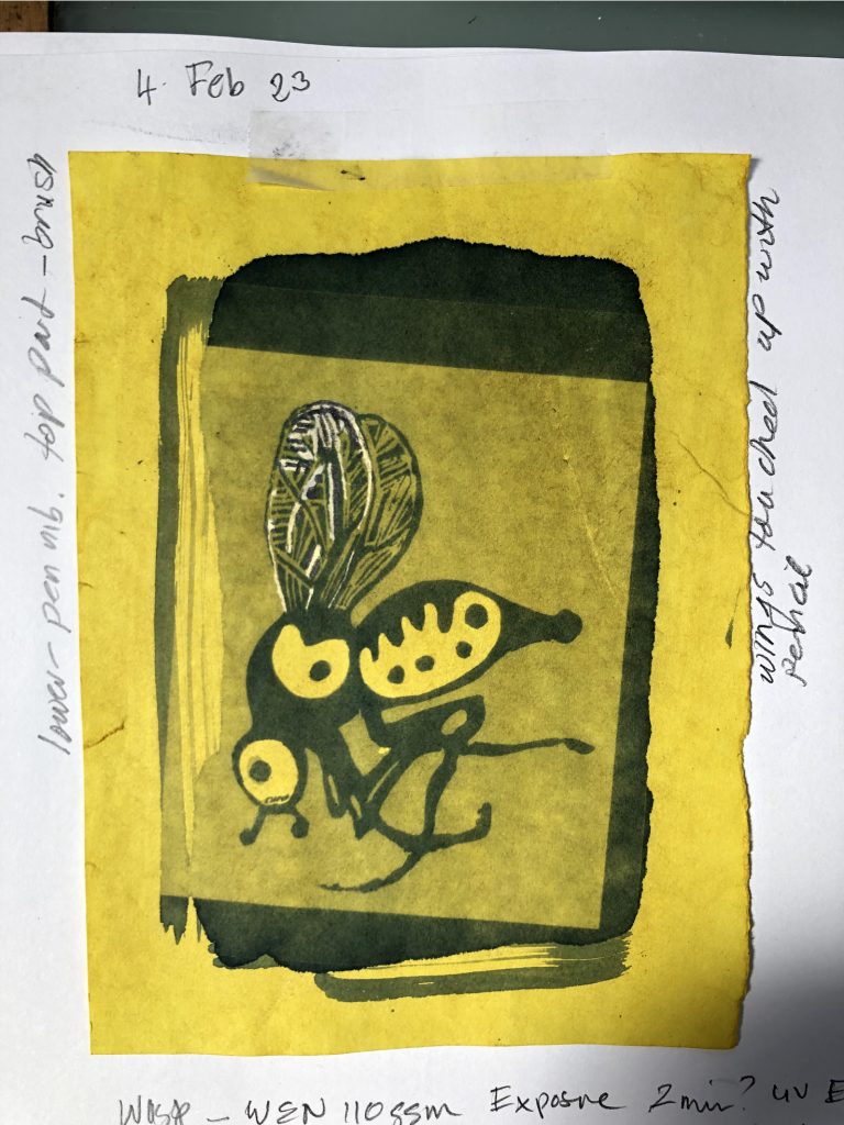
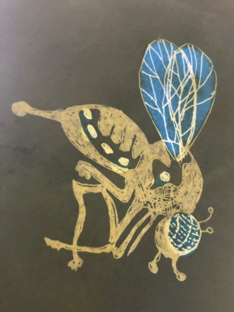
Wasp series: Exposed in LED UV exposure unit at one minute intervals. Paper ARTTEC 210 gsm prepared the day before using 2 component sensitiser set (Jacquard). Negative made on Low level Epson Workhorse inkjet printed on Solar Fast film.
Banding lines on finished print noticed for first time. They are also appear on the sun-exposed prints, but not as prominent so not the exposure unit.
TEST 2
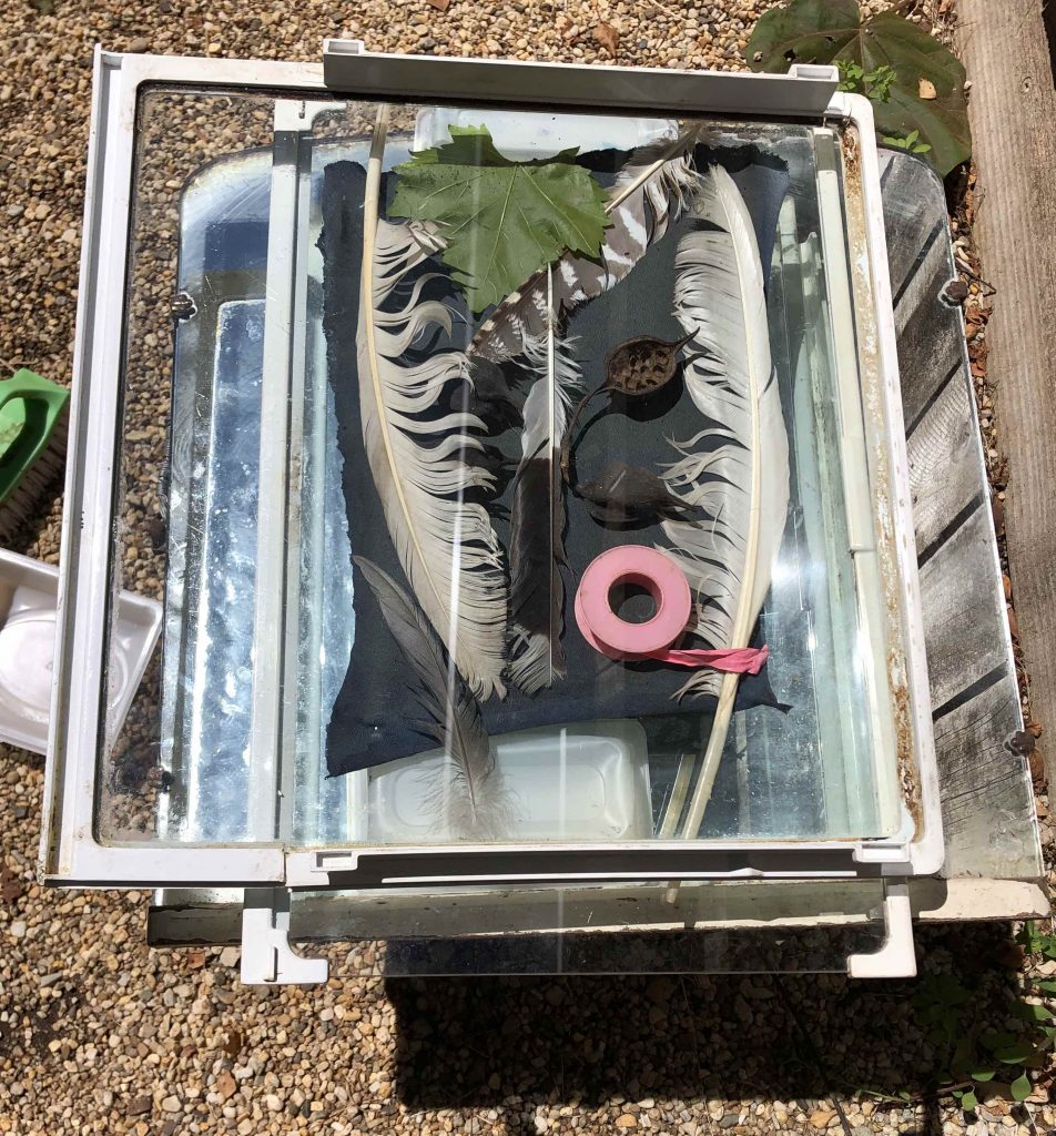
3D objects on sensitised cotton sheet. Sun/cloud day around 2:oo pm for 20 minutes. Note: Used a mirror underneath with a solid round base to underside of the sensitised sheet. Objects placed on top held down by a glass sheet. Note: Nothing was pressed down other than plumber’s Teflon roll and seed husks. The resulting print has some depth though a rich deep blue colouring. The underside had a very faint capture of the round object. I’ll retreat to the UV exposure unit after this brief attempt. I now appreciate the skill in this form of image making.
TEST 3. Wax and water.
Don’t read any further if you are a cyanotype purist.
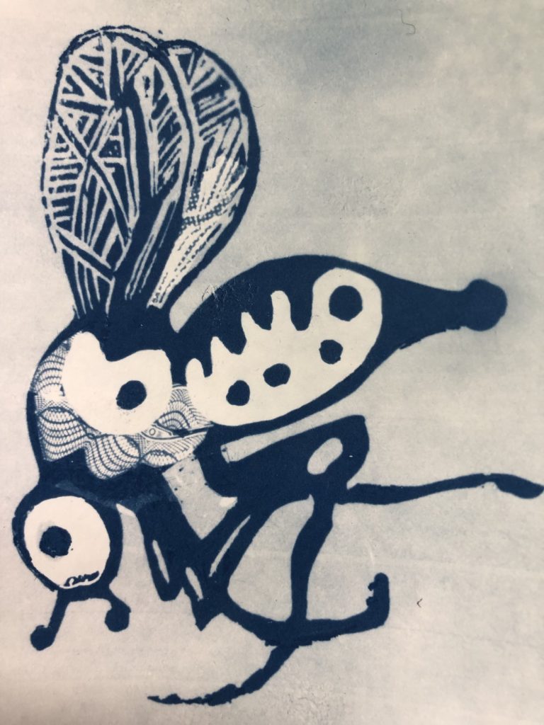
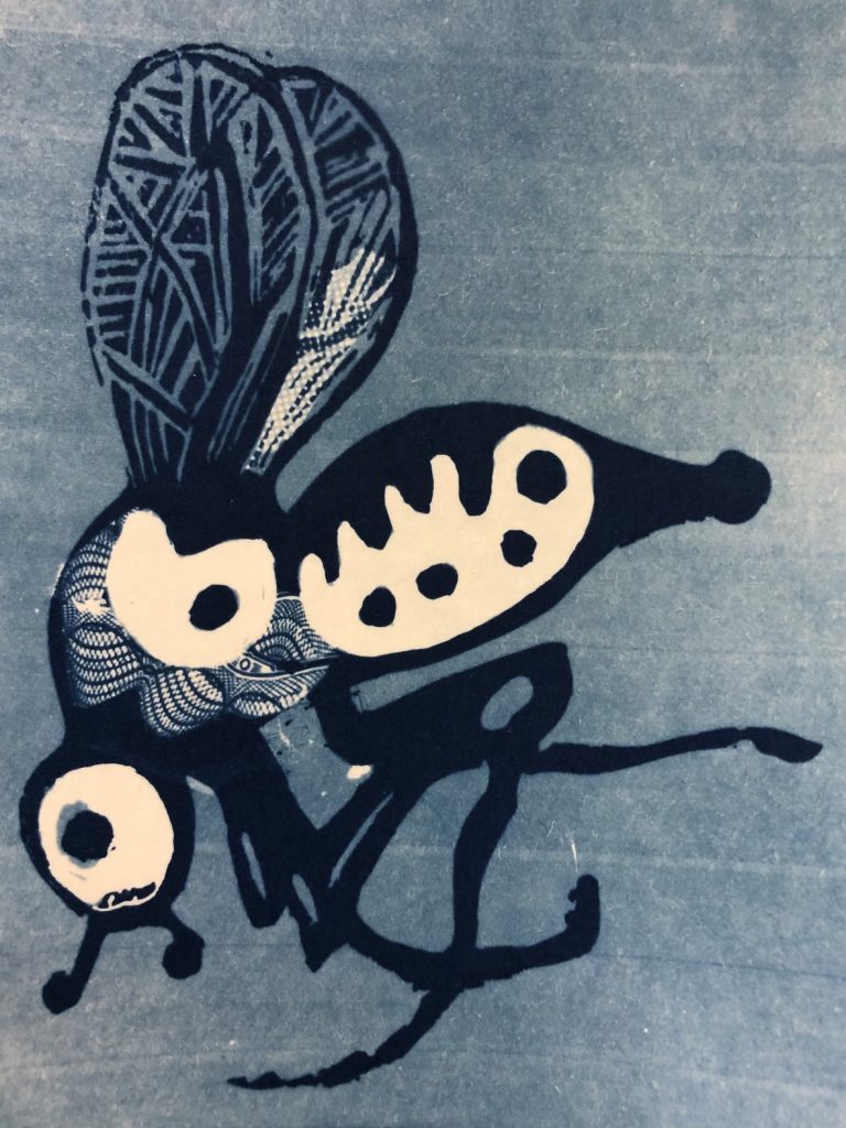
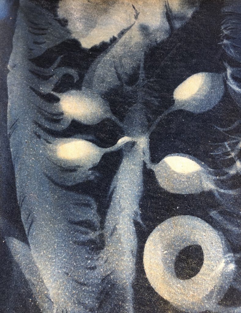
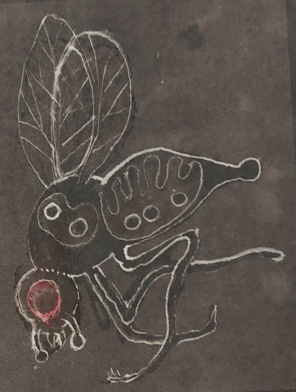
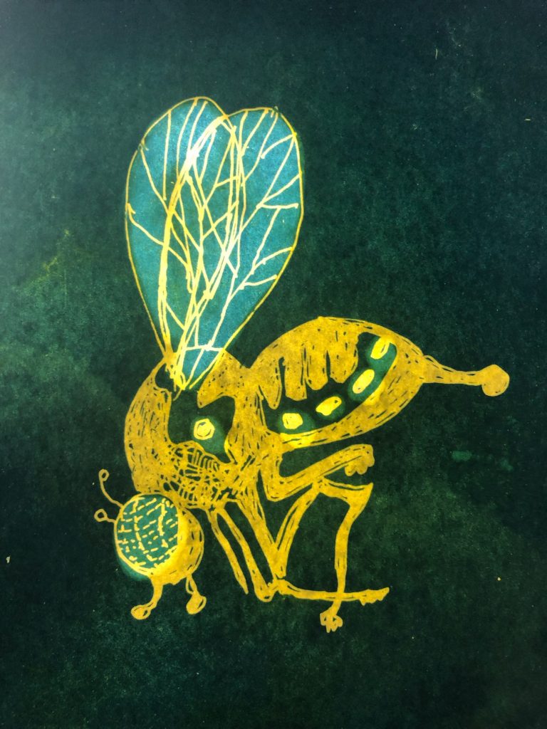
Playing with over exposed prints using diluted bleach and all the kitchen condiments for toning also led to adding line work dipped in bleach. PIC 1 shows a bleached print where the body of the wasp was coated with wax prior to placing in a diluted bleach bath. PIC 2 shows my first attempt in applying bleach with a dip pen nib to achieve line work. Some bleeding occurred. Unfortunately, I have touched up the bleeds to try and save the image -trust me, it was more ugly than what you see now. PIC 3 shows line work after a wax coating was applied. This has potential. I am assuming the wax limits the bleed. Vegetable oil and olive oil are reasonably controllable. Applied to the rear discolours the front. Apply to the front appears to give better results.
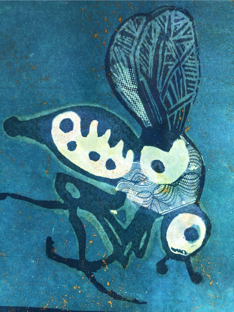
I have a long standing interest in translucent images and using transparencies. This stems from my experiences in animation, projecting moving images on solid objects and using iPads to finger draw on a glass screen. So it was a beaut surprise, in this cyanotype world, to achieve transparency when colouring the cyanotype. See PIC 4.
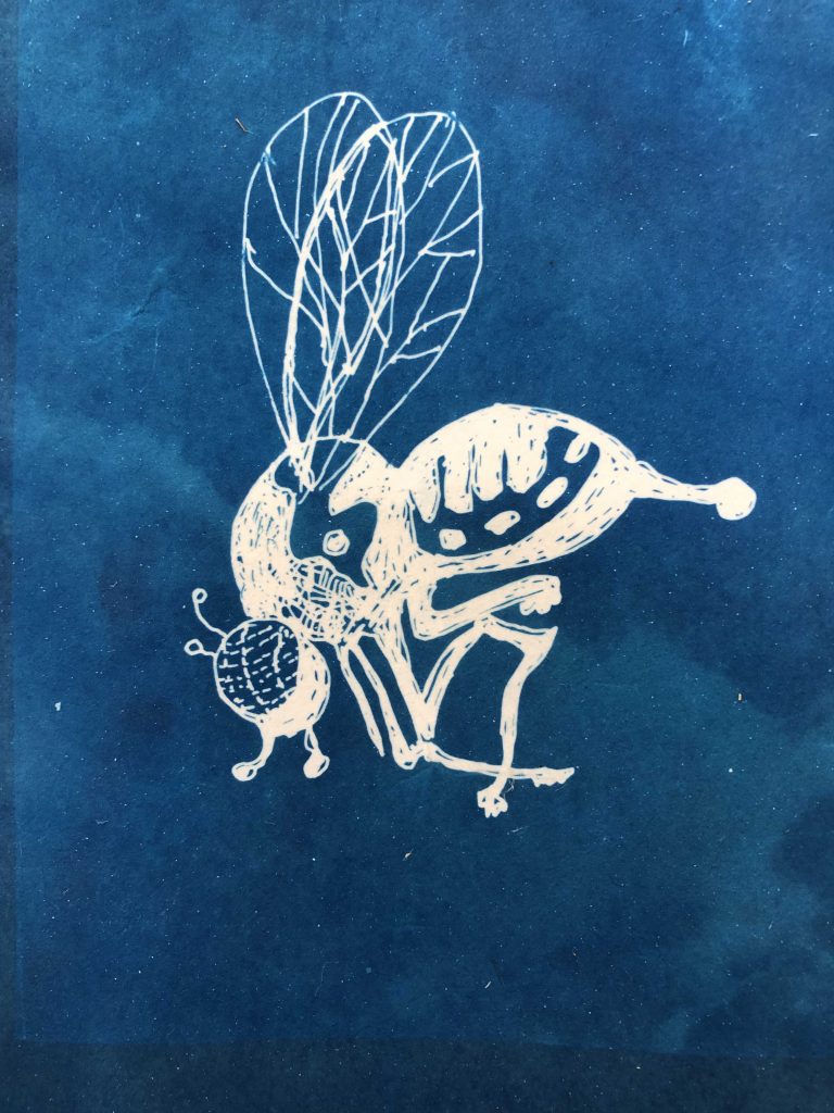
The main intent of this is remind myself again, not to give up on a work until it gives up on you- PIC3 and 5 were lost prints leading to experiments with colour and wax. I forgot a basic rule when drawing the image for my first cyanotype (PIC 5) – Remember white is black and black is white.I used this ‘blueprint’ to explore post-exposure treatments using wax and vegetable colouring.
EDIT: 12th February. After a failed photopolymer day, mainly due to curled and distorted test strips caused by my sloppy cutting, I retreated to the drawing board and made a couple of drawing negatives for cyanotypes and possible for a photopolymer etching. Scratching away at ink and celluloid with drypoint tools is “an in training session”. It is also a way to check a negative for etching by making a cyanotype print first. I can see what changes are required. Drawing with graphite and paper is more forgiving than when I transpose a drawing for a print process. It is the nuanced line having tonal differences and weight when you draw on paper. I can see glimpses, in the print below, of what could be with subtle hatching and varied line.
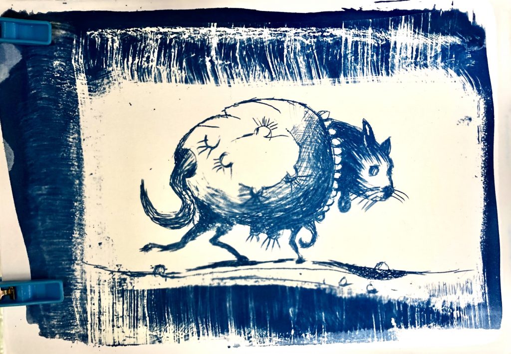
Details: The indulged cat drawn on inked acetate sheet with drypoint needle. The drawing was exposed for 120 seconds in a UV LED exposure unit onto A5 Arttec 210 gsm paper, prepared using the 2 set Jacquard cyanotype mix. (Poor photo. Whites are white).
To be continued…